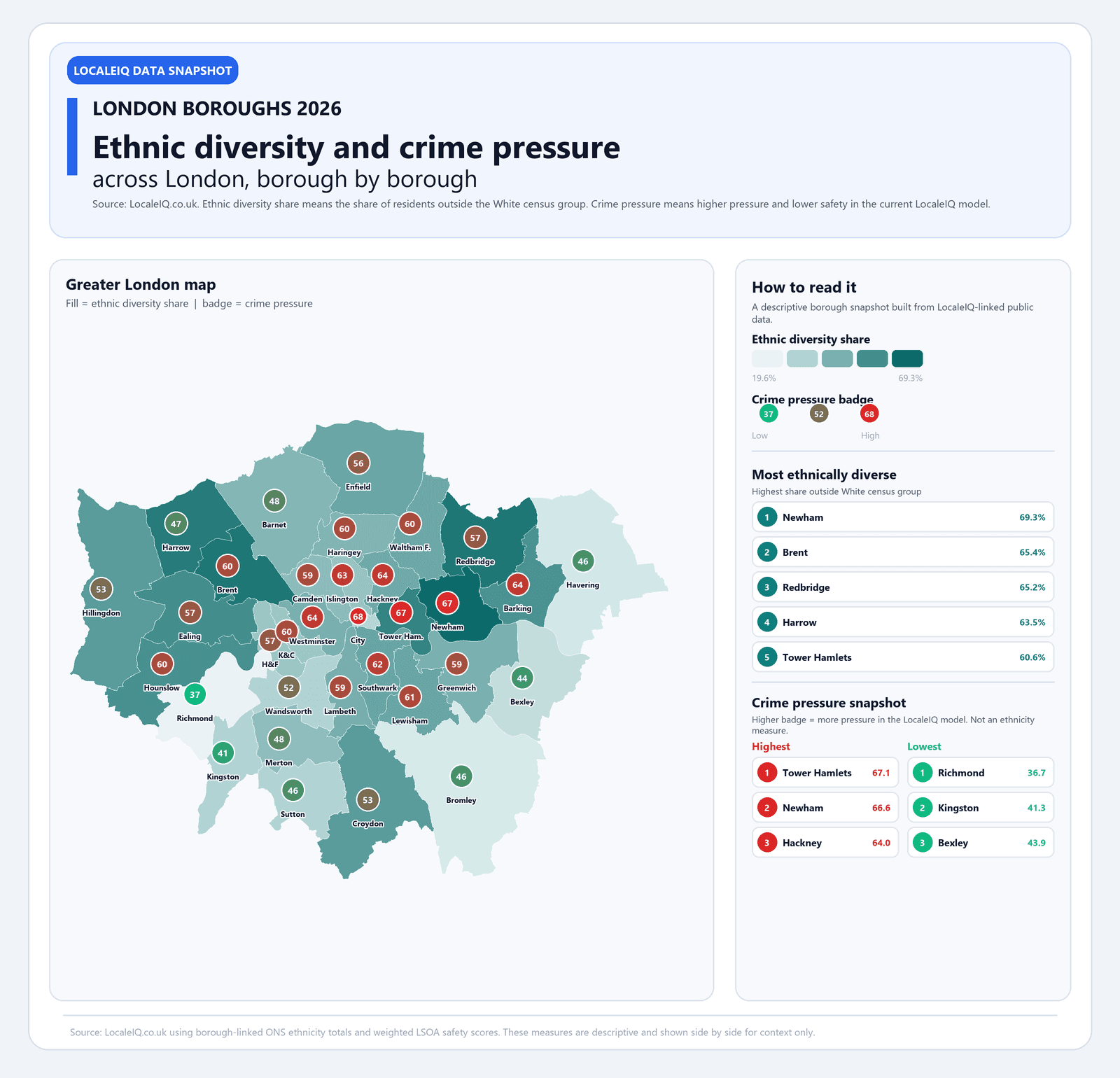
How we measured diversity and crime pressure
Ethnic diversity share is the percentage of residents outside the White census group, drawn from the latest ONS ethnicity statistics at LSOA level and aggregated to borough boundaries. It is a descriptive measure, not a value judgement: a borough with 69% diversity simply has a broader ethnic mix than one at 20%.
Crime pressure is derived from LocaleIQ's LSOA-level safety model, which weights multiple crime categories, recency, and local population density into a single safety score per small area. We then population-weight these scores to a borough average and invert the scale so that higher values mean more pressure. A borough scoring 67 has materially more crime signal per resident than one scoring 37.
Both metrics are mapped on the infographic below: borough fill colour shows diversity (darker teal means higher diversity share), while the overlaid circular badge shows crime pressure (green is low, red is high).
The most ethnically diverse London boroughs in 2026
Newham leads London with 69.3% of residents outside the White census group, followed by Brent (65.4%), Redbridge (65.2%), Harrow (63.5%) and Tower Hamlets (60.6%). These five boroughs are concentrated in east and north-west London, reflecting long-established settlement patterns and more recent population growth.
At the other end, Richmond upon Thames (19.6%), Bromley (23.6%), Havering (24.7%) and Bexley (28.1%) are the least ethnically diverse boroughs. The gap between the top and bottom is nearly 50 percentage points, which means two London postcodes can feel very different in their street-level demographic mix.
For households weighing up a move, diversity share is context rather than a decision variable on its own. But it helps explain why school catchments, high-street character, and community services differ so much between boroughs that are only a few miles apart.
Top 10 London boroughs by ethnic diversity share (2026)
| Borough | Population | Diversity share | Crime pressure |
|---|---|---|---|
| Newham | 351,069 | 69.3% | 66.6 |
| Brent | 339,824 | 65.4% | 59.8 |
| Redbridge | 310,274 | 65.2% | 56.6 |
| Harrow | 261,217 | 63.5% | 46.8 |
| Tower Hamlets | 310,322 | 60.6% | 67.1 |
| Ealing | 367,130 | 56.8% | 57.3 |
| Hounslow | 288,200 | 55.9% | 59.5 |
| Barking and Dagenham | 218,868 | 55.1% | 63.7 |
| Hillingdon | 305,871 | 51.8% | 53.3 |
| Croydon | 390,747 | 51.6% | 53.2 |
Crime pressure across London boroughs: highest and lowest
City of London tops the crime pressure ranking at 67.6, but that is partly an artefact of its tiny resident population (8,588) against very high daytime footfall. Tower Hamlets (67.1) and Newham (66.6) follow, both densely populated inner-east boroughs with a combination of high footfall, transport hubs and mixed-use streets that generate more reported incidents per resident.
The lowest crime pressure boroughs are Richmond upon Thames (36.7), Kingston upon Thames (41.3), Bromley (45.6) and Havering (45.6). These outer boroughs share lower population density, fewer major transport interchanges and more residential-only streets, all of which correlate with fewer crime reports per head.
The spread from 36.7 to 67.6 means crime pressure nearly doubles between the calmest and most pressured boroughs. For move decisions, that is a signal worth investigating at postcode level before committing, because borough averages can mask street-by-street variation.
London boroughs: 5 highest and 5 lowest crime pressure scores (2026)
| Borough | Crime pressure | Safety score | Population |
|---|---|---|---|
| City of London | 67.6 | 32.4 | 8,588 |
| Tower Hamlets | 67.1 | 32.9 | 310,322 |
| Newham | 66.6 | 33.4 | 351,069 |
| Hackney | 64.0 | 36.0 | 259,112 |
| Westminster | 63.7 | 36.3 | 204,214 |
| Richmond upon Thames | 36.7 | 63.3 | 195,306 |
| Kingston upon Thames | 41.3 | 58.7 | 168,033 |
| Bromley | 45.6 | 54.4 | 330,007 |
| Havering | 45.6 | 54.4 | 261,995 |
| Harrow | 46.8 | 53.2 | 261,217 |
Diversity and crime pressure do not move in lockstep
One of the clearest takeaways from the data is that diversity share and crime pressure are not the same signal. Harrow is the fourth most diverse borough in London (63.5%) but has below-average crime pressure (46.8). Conversely, Westminster is only moderately diverse (44.8%) but ranks among the highest for crime pressure (63.7) because of its central location and tourist and commuter footfall.
This matters because lazy analysis often conflates the two. The data shows they are separate dimensions. A borough can be highly diverse and calm, or less diverse and pressured, depending on density, transport, land use and economic mix. Treating them as correlated leads to worse move decisions.
If you are comparing two boroughs, look at both metrics independently, then drill into postcode-level data for the specific streets you are considering. Borough averages are a useful first filter, but the decision usually comes down to a smaller radius.
Full borough data table
The table below shows all 33 London boroughs sorted by diversity share, with population, safety score and crime pressure. Use it as a reference when comparing specific boroughs or when you want to see where a particular area sits in the London-wide distribution.
All 33 London boroughs: diversity, safety and crime pressure (2026)
| Borough | Population | Diversity % | Safety score | Crime pressure |
|---|---|---|---|---|
| Newham | 351,069 | 69.3% | 33.4 | 66.6 |
| Brent | 339,824 | 65.4% | 40.2 | 59.8 |
| Redbridge | 310,274 | 65.2% | 43.4 | 56.6 |
| Harrow | 261,217 | 63.5% | 53.2 | 46.8 |
| Tower Hamlets | 310,322 | 60.6% | 32.9 | 67.1 |
| Ealing | 367,130 | 56.8% | 42.7 | 57.3 |
| Hounslow | 288,200 | 55.9% | 40.5 | 59.5 |
| Barking and Dagenham | 218,868 | 55.1% | 36.3 | 63.7 |
| Hillingdon | 305,871 | 51.8% | 46.7 | 53.3 |
| Croydon | 390,747 | 51.6% | 46.8 | 53.2 |
| Southwark | 307,623 | 48.6% | 38.0 | 62.0 |
| Lewisham | 300,568 | 48.5% | 39.4 | 60.6 |
| Enfield | 329,987 | 47.9% | 44.4 | 55.6 |
| Waltham Forest | 278,444 | 47.2% | 40.4 | 59.6 |
| Hackney | 259,112 | 46.9% | 36.0 | 64.0 |
| Lambeth | 317,668 | 45.0% | 40.8 | 59.2 |
| Westminster | 204,214 | 44.8% | 36.3 | 63.7 |
| Greenwich | 289,057 | 44.3% | 41.4 | 58.6 |
| Haringey | 264,227 | 43.0% | 39.8 | 60.2 |
| Barnet | 389,365 | 42.3% | 52.3 | 47.7 |
| Camden | 210,163 | 40.5% | 40.8 | 59.2 |
| Merton | 215,172 | 39.8% | 51.9 | 48.1 |
| Islington | 216,608 | 37.8% | 36.7 | 63.3 |
| Hammersmith and Fulham | 183,161 | 36.8% | 43.2 | 56.8 |
| Kensington and Chelsea | 143,365 | 36.3% | 40.2 | 59.8 |
| Wandsworth | 327,549 | 32.2% | 47.6 | 52.4 |
| Kingston upon Thames | 168,033 | 31.7% | 58.7 | 41.3 |
| Sutton | 209,582 | 31.7% | 54.0 | 46.0 |
| City of London | 8,588 | 30.6% | 32.4 | 67.6 |
| Bexley | 246,494 | 28.1% | 56.1 | 43.9 |
| Havering | 261,995 | 24.7% | 54.4 | 45.6 |
| Bromley | 330,007 | 23.6% | 54.4 | 45.6 |
| Richmond upon Thames | 195,306 | 19.6% | 63.3 | 36.7 |
How to use this data when comparing London areas
Borough-level data is a filter, not a verdict. It tells you which parts of London are worth investigating at street level and which sit outside your tolerance before you even open a listing. If crime pressure above 60 is a dealbreaker, you have already narrowed London from 33 boroughs to roughly 15.
The next step is postcode-level comparison. LocaleIQ lets you search a specific postcode and see safety, deprivation, planning, HMO and roadworks signals layered on the same map. That turns a borough-level shortlist into a street-level decision, which is where moves are actually won or lost.
Diversity share adds a different kind of context. It helps explain why two boroughs with similar crime pressure can feel very different on the ground: school demographics, high-street retail mix, community infrastructure and language diversity all follow from the demographic composition. If that matters to your household, the borough table above gives you a starting point.
- Use crime pressure to filter boroughs that sit outside your safety tolerance.
- Use diversity share to understand demographic context, not as a quality signal.
- Drill into postcode-level data before committing to any specific street or property.
- Compare at least two candidate postcodes side by side rather than evaluating one in isolation.
FAQ
What is the most diverse borough in London in 2026?
Newham is the most ethnically diverse London borough in 2026, with 69.3% of residents outside the White census group. Brent (65.4%), Redbridge (65.2%) and Harrow (63.5%) follow closely behind.
Which London borough has the lowest crime pressure?
Richmond upon Thames has the lowest crime pressure score (36.7) in the 2026 LocaleIQ model, followed by Kingston upon Thames (41.3) and Bromley (45.6). These are all outer London boroughs with lower density and fewer major transport hubs.
Does ethnic diversity correlate with higher crime in London?
No. The data shows these are independent dimensions. Harrow is the fourth most diverse borough but has below-average crime pressure. Westminster is only moderately diverse but ranks among the highest for crime pressure. Density, transport, land use and footfall are stronger predictors of crime pressure than demographic composition.
How is crime pressure calculated in this analysis?
Crime pressure is derived from LocaleIQ's LSOA-level safety model, which weights multiple crime categories, recency and local population density into a single safety score. Borough scores are population-weighted averages of the LSOAs within them, inverted so that higher values mean more pressure.
Which London boroughs are safest for families in 2026?
Based on the safety model, the lowest-pressure boroughs are Richmond upon Thames, Kingston upon Thames, Bromley, Havering and Harrow. These combine lower crime signal with more residential character, though families should also check school quality and commute times at postcode level before deciding.
Should I use borough-level data to choose where to live in London?
Borough data is a useful first filter, but move decisions are made at postcode level. Use the borough table to narrow your shortlist, then compare specific postcodes using LocaleIQ's area analysis to see safety, deprivation, planning and HMO signals on the same map.